x
Sometimes before adding on you must subtract.
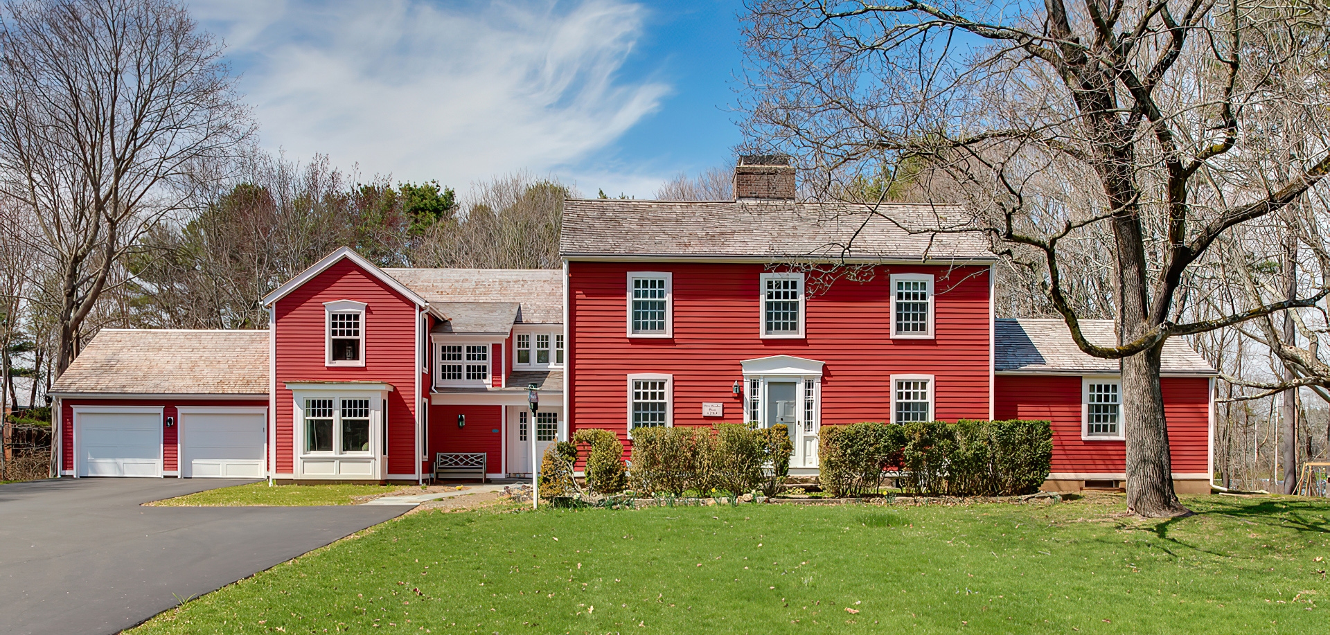
A family of four had lived in this house, c. 1732, for several years. They loved the oldest parts, its character and sensible layout. However, a series of poorly planned additions in the 50s and 60s became a sore spot. We drew a clear, dotted line around everything good — then precisely cut the bad.
In our planning, we set out to reduce the house to the oldest core and create a new expansion to better suit their lifestyle. It was imperative to preserve the usefulness and relevance of the old areas, which they wanted to continue enjoying.
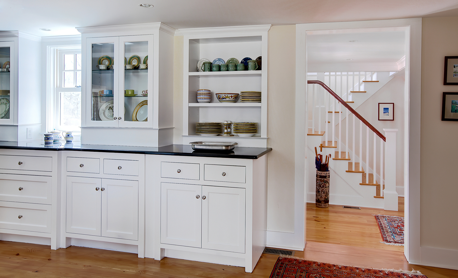
The first floor front rooms are still used as library and living area. The dining room is also used, but greatly opened, creating a fresh transition between the compartmentalized old-style floor plan and the new open layout. Upstairs, the children’s rooms are unchanged, except where connected by a hallway to the parents’ new area in the addition.
The exterior form, with elements scaled to complement the distinct shape of the original, now embodies its expanded functions. At the juncture of the old and new around the new entry, a courtyard effect is created.
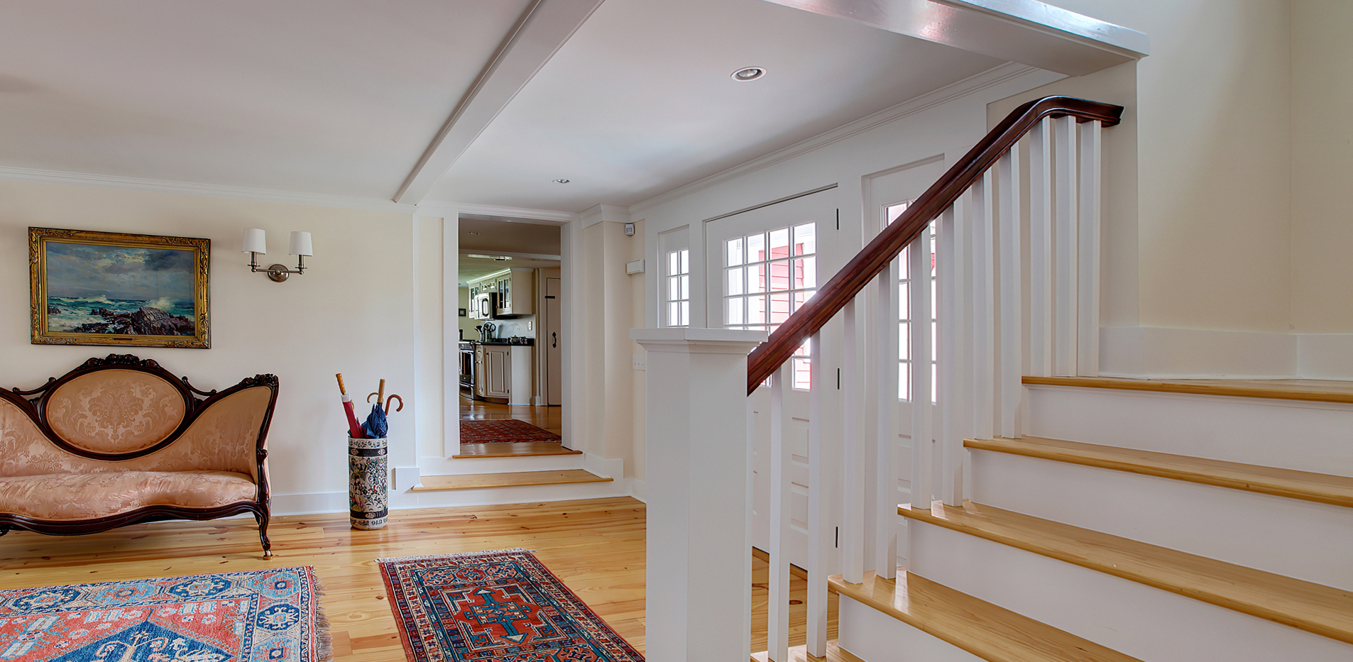
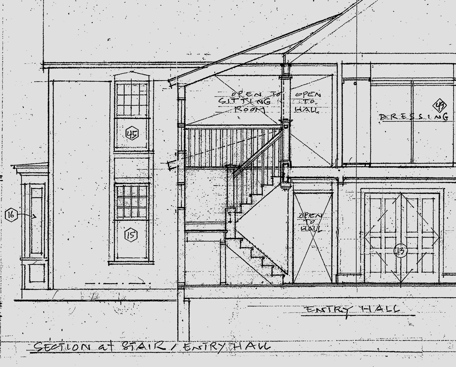
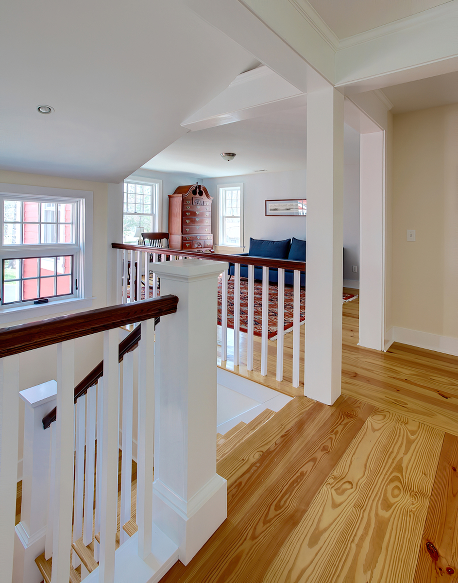
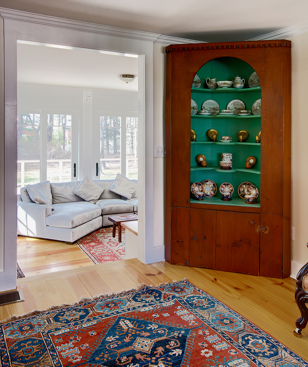
By dropping the floor 12 inches from old to new areas, we devised greater ceiling height for the new rooms. A further 18 inch descent into the family room provides a single room with great height, giving variety to the overall layout. The new second floor heights have also been improved. All this was accomplished without letting the scale of the new overshadow the original proportions.



i
-
+
